Earth Design System
A 3-package, WCAG 2.1 AA design system built from scratch at FrankCrum and adopted by 2 product teams — cutting frontend delivery time 30–40%.
Problem
Two product teams (~10 engineers) were shipping inconsistent UI with duplicated components, each with its own accessibility gaps and visual drift, and no shared source of truth to design or build against — every new feature meant re-litigating the same styling and interaction decisions.
Solution
Architected Earth from scratch as three packages: earth (CSS tokens for cross-framework reuse), earth-react (~50 components across foundations, navigation, layout, and utilities), and earth-form (15 form components with Zod and React Hook Form wired in internally — validation, error handling, and field state managed for consumers). Enforced WCAG 2.1 AA across every component, audited with Axe and validated with screen readers and full keyboard navigation, and backed it with behavior-focused unit tests so teams could adopt without coordination overhead.
30–40% faster
Frontend delivery time
50+
Components shipped
2 (~10 engineers)
Teams adopted
Tech stack
Architecture
Earth ships as three separate packages instead of one monolith, each with a distinct job:
earth— framework-agnostic CSS tokens (color, spacing, radius, typography) so the same visual language works outside React too, wherever FrankCrum needs it.earth-react— ~50 components consuming those tokens, organized into eight categories: Foundations (colors, typography, spacing, radius, logo), Form (button, input, select, combobox, date picker, switch, chip, and more base primitives), Feedback (alert, toast, dialog, drawer, popover, tooltip, spinner), Data Display (tag, table, avatar, divider, stacked data), Navigation (tabs, breadcrumbs, pagination, stepper, sidebar, menu), Surfaces (card, accordion, footer, bottom sticky bar), Layout, and Utilities.earth-form— 15 field-level components (text, number, phone, SSN, bank account, date, file upload, combobox, and more) that wrapearth-react’s form primitives with React Hook Form registration, Zod validation, and input masking already wired in.
The split matters in practice: a team building a simple marketing page pulls only earth and a handful of
earth-react primitives, while a team building a data-heavy internal tool pulls in earth-form and gets
validation, masking, and accessible error states for free instead of assembling React Hook Form, Zod, and IMask
by hand for every field.
Design tokens
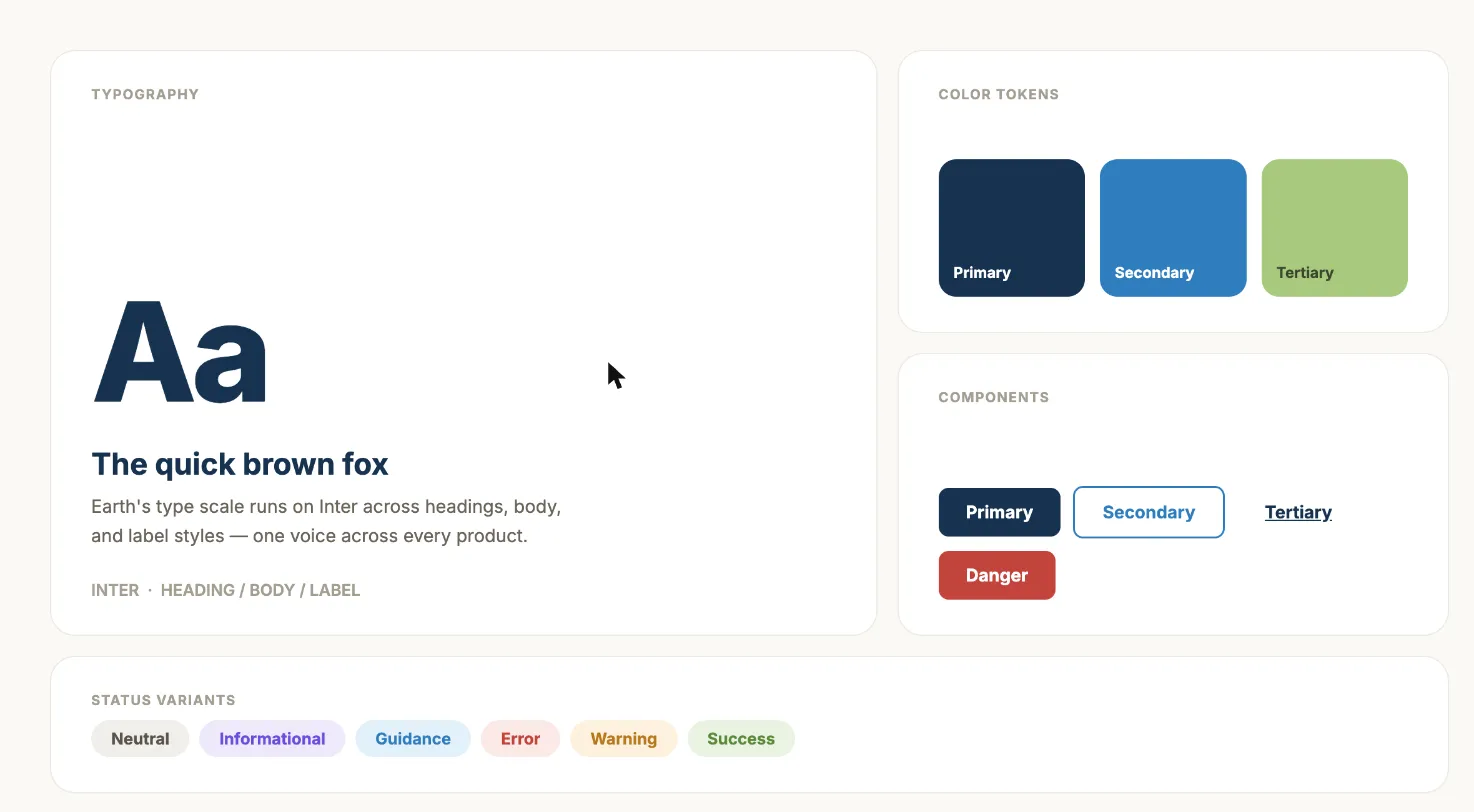
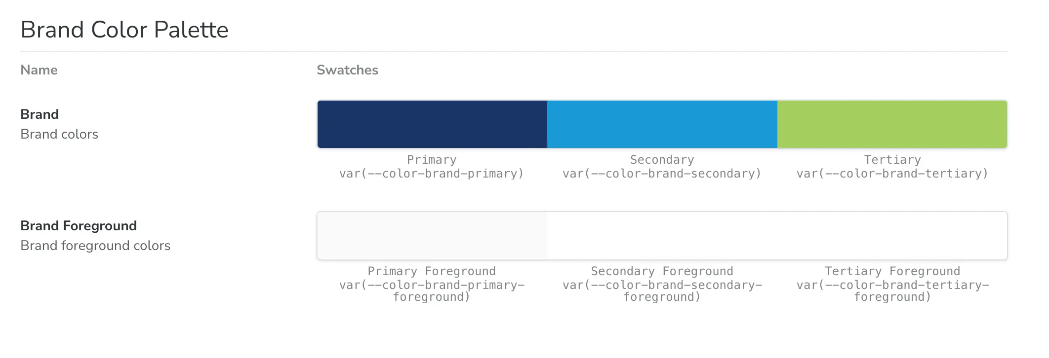
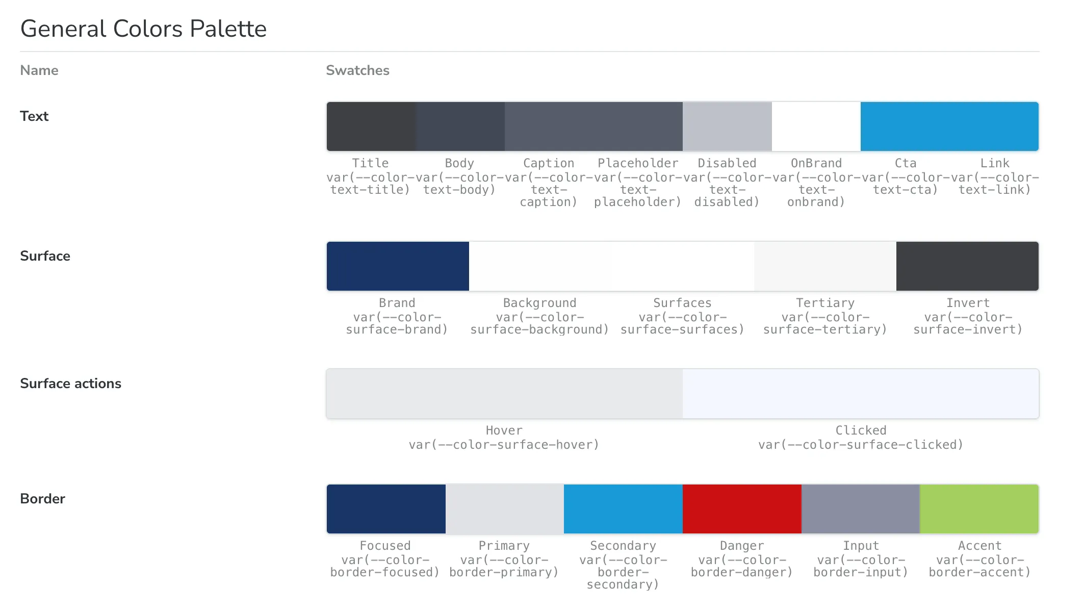
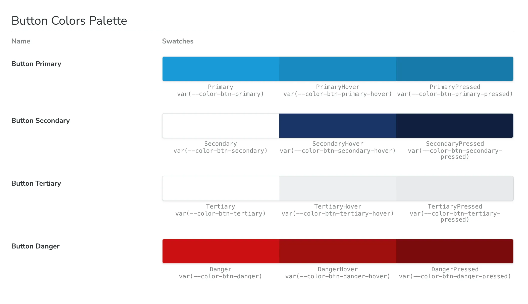
Every component traces back to a small set of tokens rather than one-off values: a brand color scale (primary, secondary, tertiary, each with its own foreground pairing) plus semantic text and surface tokens. Change a token and every consuming component updates — no find-and-replace across two codebases.
A shared semantic language
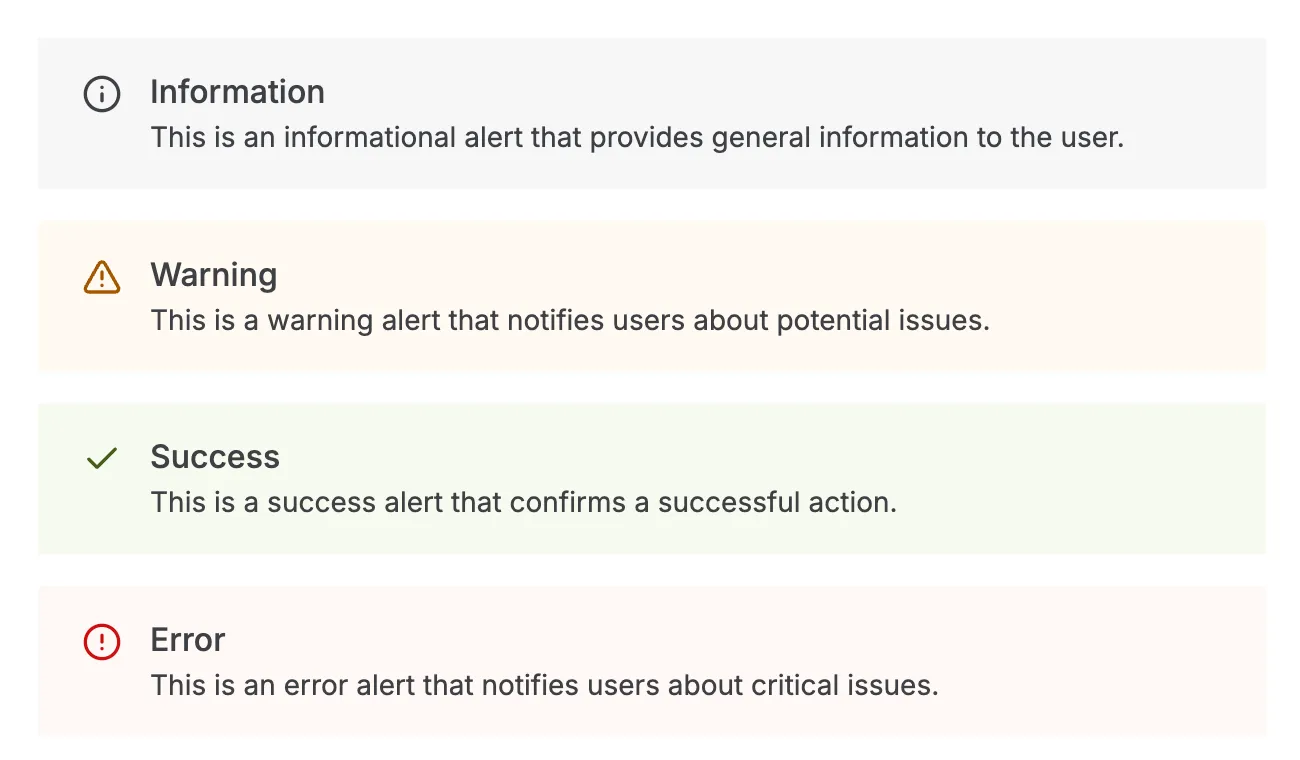
Status and category components — alerts, tags, form errors — all speak the same six-variant vocabulary: Neutral, Informational, Guidance, Error, Warning, Success. A warning reads as a warning whether it shows up in a banner, a tag, or a validation message, instead of every team inventing its own shade of “something’s wrong.”

Typography and navigation primitives
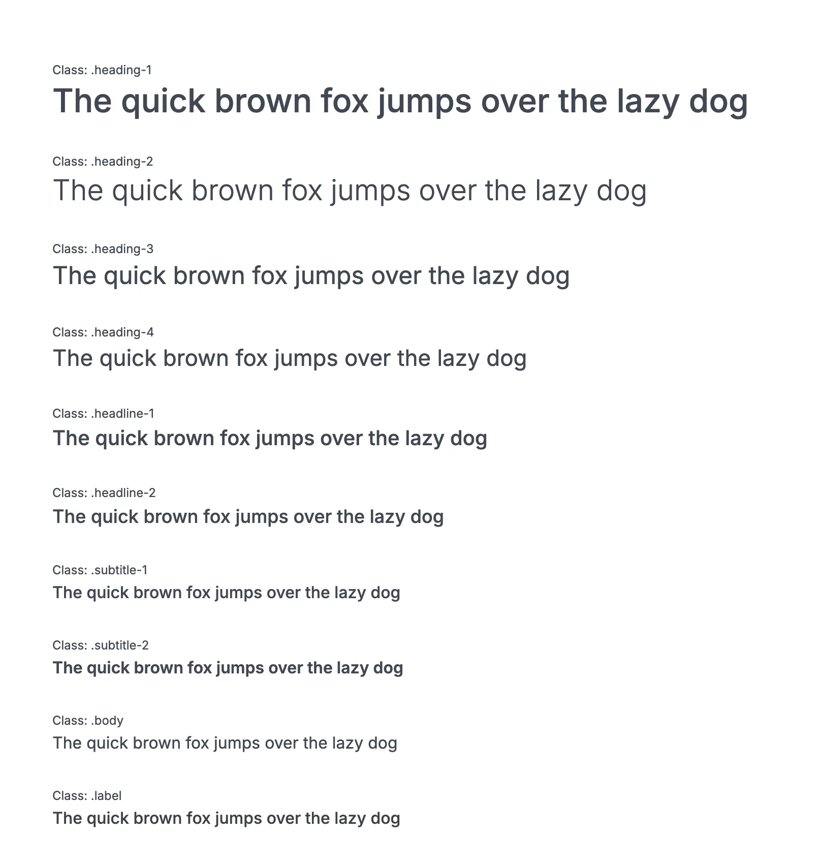
The type system runs on a defined scale — headings, headlines, subtitles, body, and label styles — all built on Inter, so a heading in one product looks and behaves like a heading in another.
Navigation components follow the same discipline. The Stepper, for example, renders a three-state progress flow
(default, current, complete) with full keyboard support and aria-current="step" wired in — one of several
navigation primitives (tabs, breadcrumbs, pagination, sidebar) built as real semantic HTML rather than div soup.
On small screens it collapses to a compact summary instead of squeezing the full vertical list into place.


Accessible drag-and-drop
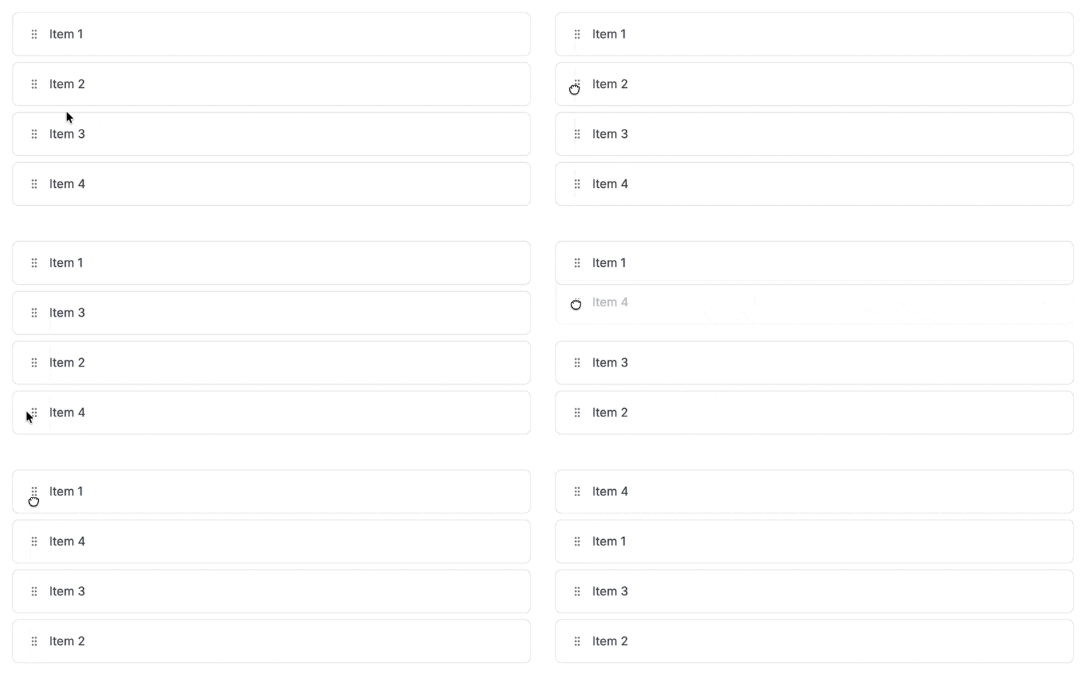
Not every interaction is a static component. DragArea is a compound component (DragArea / DraggableItem /
DragHandle) built on dnd-kit for reorderable lists — and like everything else in Earth, it’s fully usable
without a mouse: focus a handle, press Space to pick it up, move it with the arrow keys, and confirm with Space or
Enter (Escape cancels). dnd-kit injects live-region announcements automatically, so a screen reader user gets the
same “picked up,” “moved to position 3,” “dropped” feedback a sighted user gets visually.
Governance
Earth isn’t a single-owner side project — it runs under a written governance agreement between design and engineering: a cross-functional working group reviews and approves new components, contributions go through an RFC-style proposal template reviewed by both a developer and a designer, and releases follow semantic versioning so consuming teams always know whether an update is safe to pull. That process is what let two product teams adopt the system without needing to coordinate directly with each other.
Beyond the components
SSR-compatible with both a React SPA and .NET BFF services, so teams on either stack could adopt it without a rewrite. Alongside the system rollout, led a parallel codebase modernization — standardized patterns, hardened security, and set up the contribution workflow described above.
The most interesting piece: an internal AI agent orchestrator connecting Figma to Earth via MCP, letting non-technical designers and product stakeholders prototype directly against the real system — Figma tokens mapped 1:1 to Earth’s design tokens, components bootstrapped automatically, every output gated behind human code review before merge.
The source is FrankCrum’s private repository and can’t be linked here. Every screenshot above is from the real, running Storybook — no business data, just the component library itself.
